Intro
Terra Firma
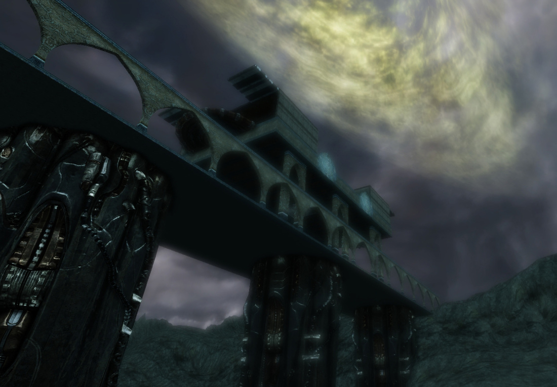
With that idea in mind I set out to design the biggest map I had created. I made sure to build the entire map solely using the terrain editor inside of UDK. All the structures in the level are made out of either preexisting assets inside of UDK and BSP.
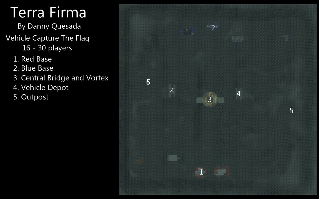
The terrain is rough and can be hard to navigate. Players are strongly encouraged to use a hover board when not in a vehicle. Running around on foot will leave you at a huge disadvantage.
Vehicles
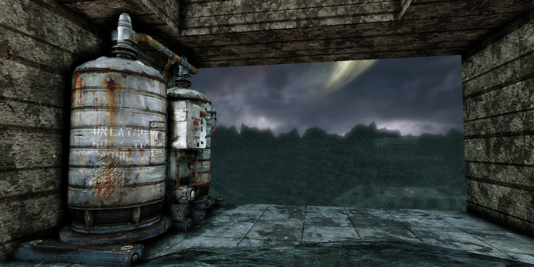
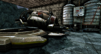
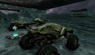
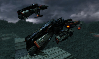
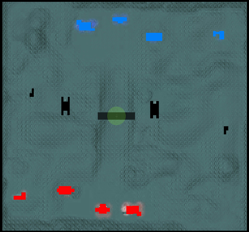
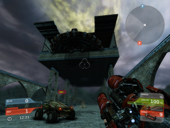
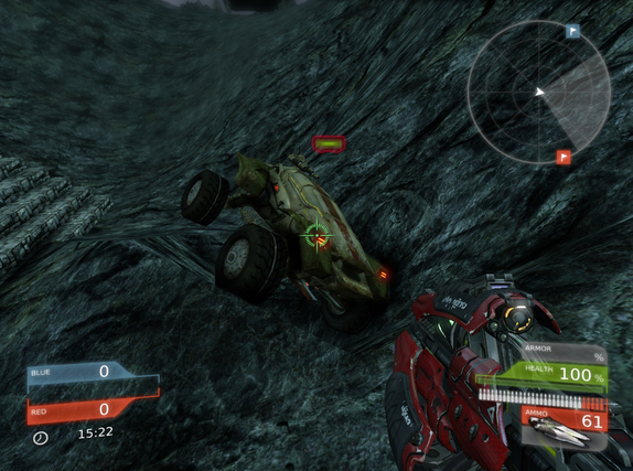
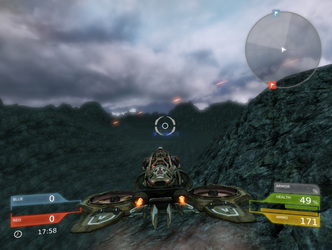
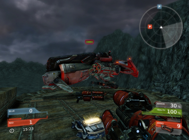
Vehicles are located all over the map. Players spawn near hangars and garages where vehicles are spawned. Cicadas are harder to find and are spawned on landing pads. Both bases have vehicles that can only be accessed by their respective teams. Any vehicle spawned outside of the base is neutral and can be accessed by anyone.
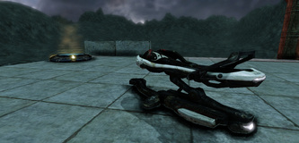
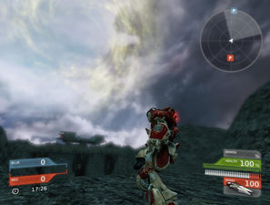
Every player comes equipped with a hoverboard that can be accessed by simply pressing the "Q" key. The hoverboard can easily be combined with the jump pads in the level for quick speed boosts that will help the player escape danger.
No Clear Paths
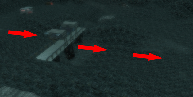
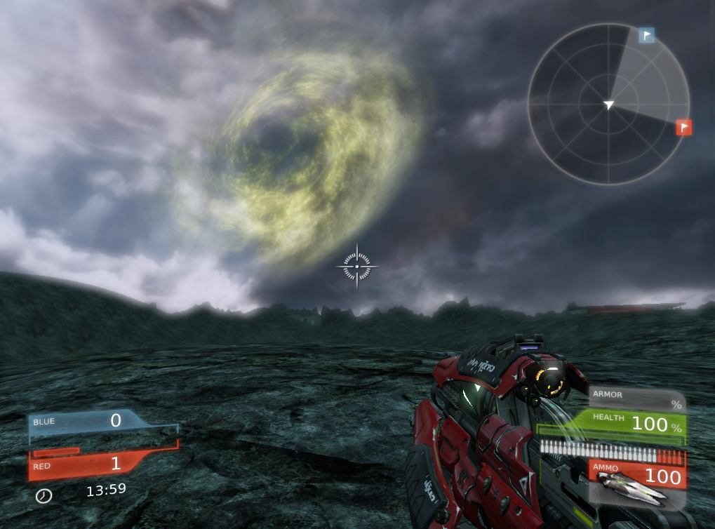
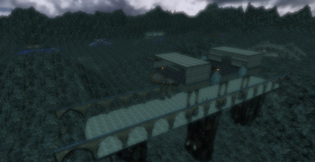
| As soon as the game starts there is no clear indication as to where the player is meant to go. The opposing team and flag is straight ahead, but there is no clear path. The only path clearly visible to the player is the direct path that runs under the central bridge. The direct path serves for an easy route for scorpions and mantas to take to reach the other side. The problem with this path is that it is just a big straight line! There is no way to change direction once the player decides to drive down this route. Making it an easy spot to be ambushed and attacked. |
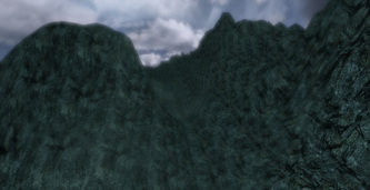
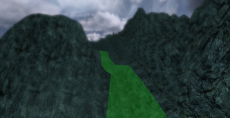
Having a valley design isn't a bad thing if done correctly. If the valley is designed where there are ambush points on top and exits/retreat locations in the valley we could in theory design a very fun combat area in the map that will give players an interesting dynamic to play around with.
Wide Open Spaces and Uneven Terrain
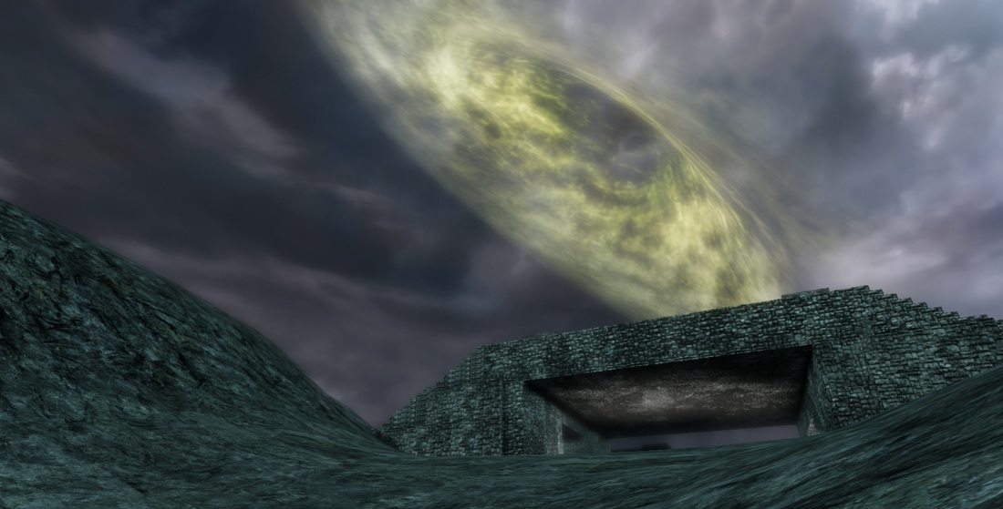
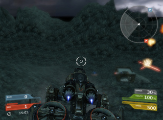
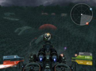
| This map is huge! It was designed for 15 vs 15 combat and it shows. The major issues with this large design is that we have so many wide open areas that are just uninteresting, bland and overall pointless. This is very problematic when areas that become rocky and steep that they are nearly impossible to traverse on foot or even with the scorpion. These wide open spaces always leave the player vulnerable to attack. There is no rocks or any sort of cover for players to maneuver their vehicles around. This leaves them wide open to attack, especially from aerial vehicles. |
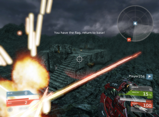
The map is designed specifically for vehicular combat but this is all brought to a stand still when players are forced to carry the flag back to base solely on the hoverboard. With the way the map is designed (wide open spaces for vehicles.) we end up with areas that become shooting galleries. It takes luck rather than skill for a player to return back to base.
The map has no areas that gives players on foot or hoverboards any sort of advantage. The map should've been designed with this in mind. At the moment it just suitable for the manta and no other vehicle. This makes retrieving the flag a very tiresome chore.
Combat
There are some large hills and mountains around the map but those do no good when enemies can simply fly over them while in the manta. The overall tone of the combat is boring because the design of the map just leads to rushing. Players don't spend time trying to controls the bridge or vehicle depots. Areas like that are barley even distractions. Combat is direct and boring, it doesn't reward the player for trying a new approach or tactic.
Good Theme Poorly Executed
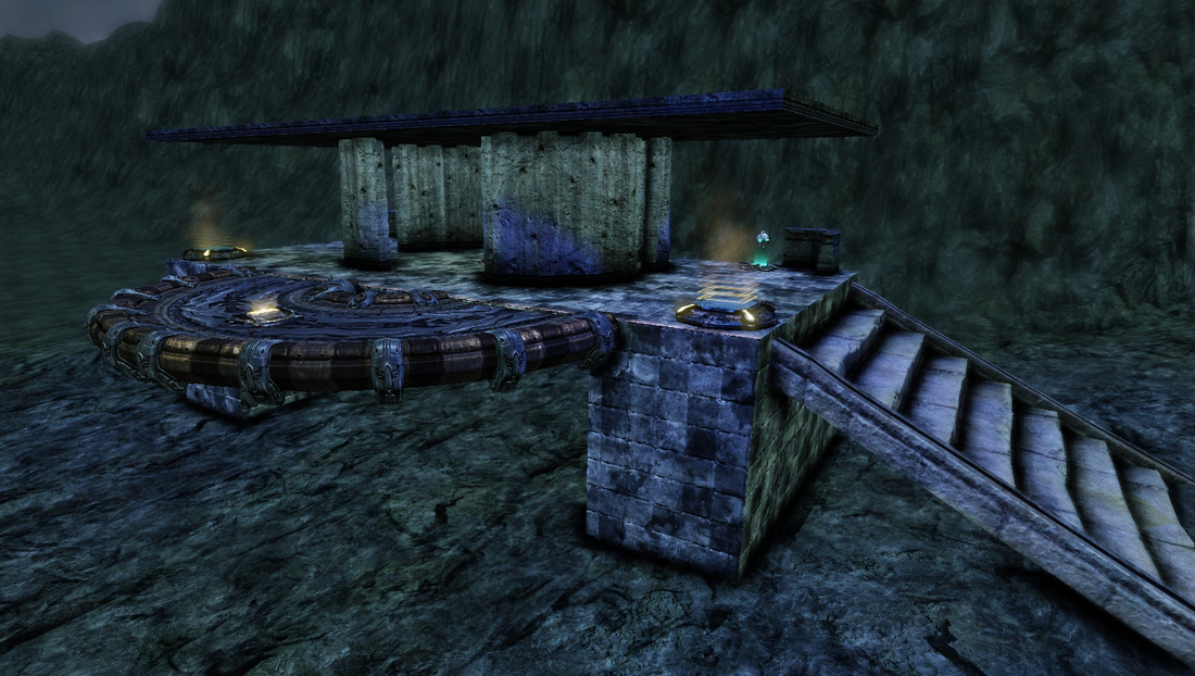
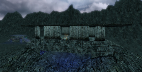
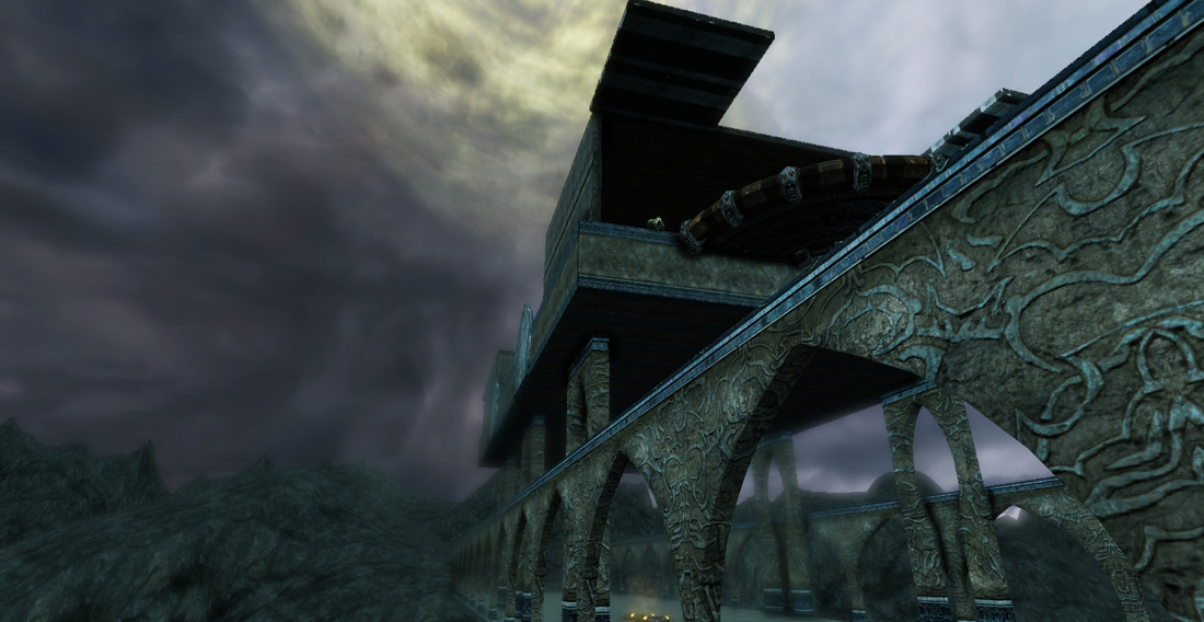
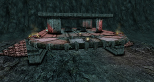
| The problem here is that most of the shifts in terrain are done through the terrain editor. What should have been done is a mix of the terrain with art assets of rocks and buildings to make it stand out, to give the map some sort of contrast. At the moment it looks really gray, everything looks like it is made of stone. Certain structures, such as the blue/red base should have been built from the UDK assets to make them looks like man made structures. The terrain should be the only rocky looking thing in the map. You know you have successfully executed a theme when a player can identify it immediately. Think about your favorite map from your favorite FPS. It looks exactly like what the name is. For example, in Call of Duty : Modern Warfare 2 there is a map called "Terminal" and it looks like an airport terminal. Even with something as abstract as a planet being terraformed by two rival factions there are no clues or hints as to what this map is supposed to be. Nothing about this map makes any sense in terms of it's theme. |
Conclusion
@Dannylv100
P.S. - I have one more of my old levels to be analyzed for Level Design 101. I should have the next blog post up in about a month or so. I would like to do a mail bag post where I answer game/level design questions. Please feel free to comment/ask questions. Thanks for reading.




 RSS Feed
