dannylv100.com
  • Projects
    • A Game In the Dark
    • Flat Kingdom
    • Aero
    • Freeze-E Frosty's
    • 3rd Person Shooter
  • Blog
  • Resume

Messing around with Unity

12/24/2012

1 Comment

 
Picture
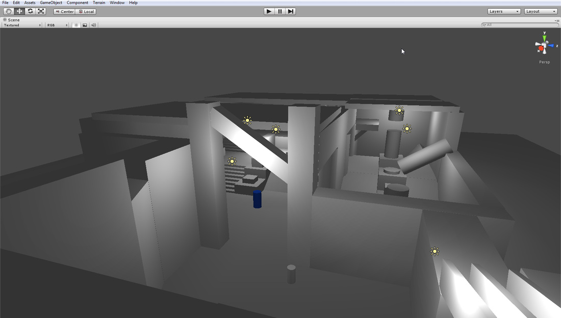
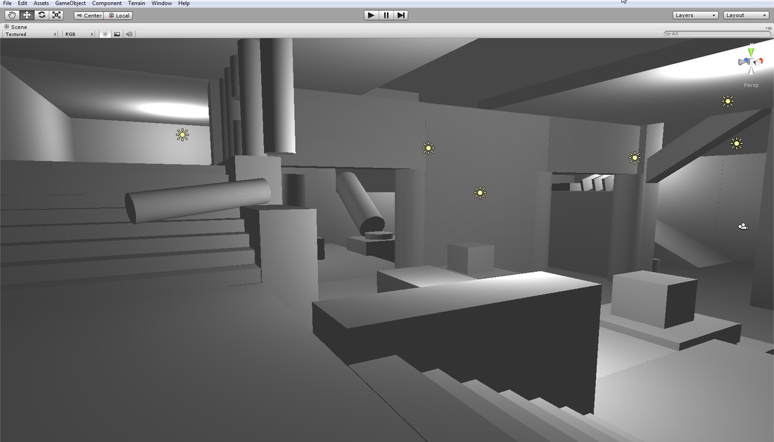
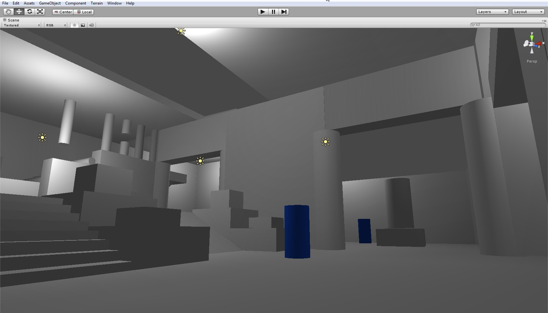
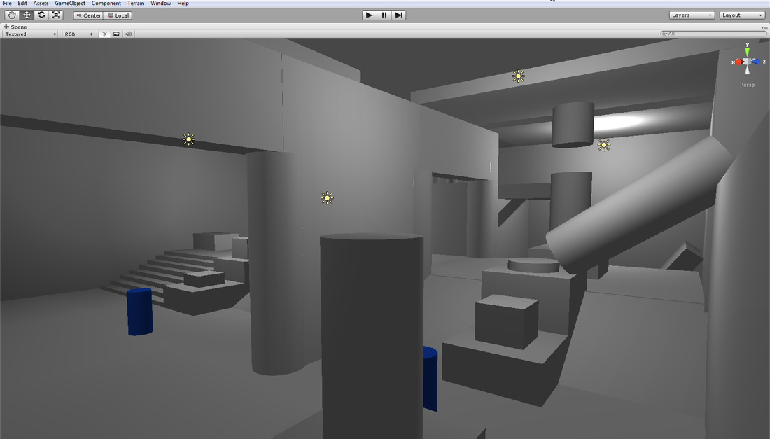
   I decided to mess around with Unity for a few days. I learned all the basics of navigation, placing lights, materials and layout. My goals here was to create a simple layout of a level so I can master all the controls.
Picture
Picture
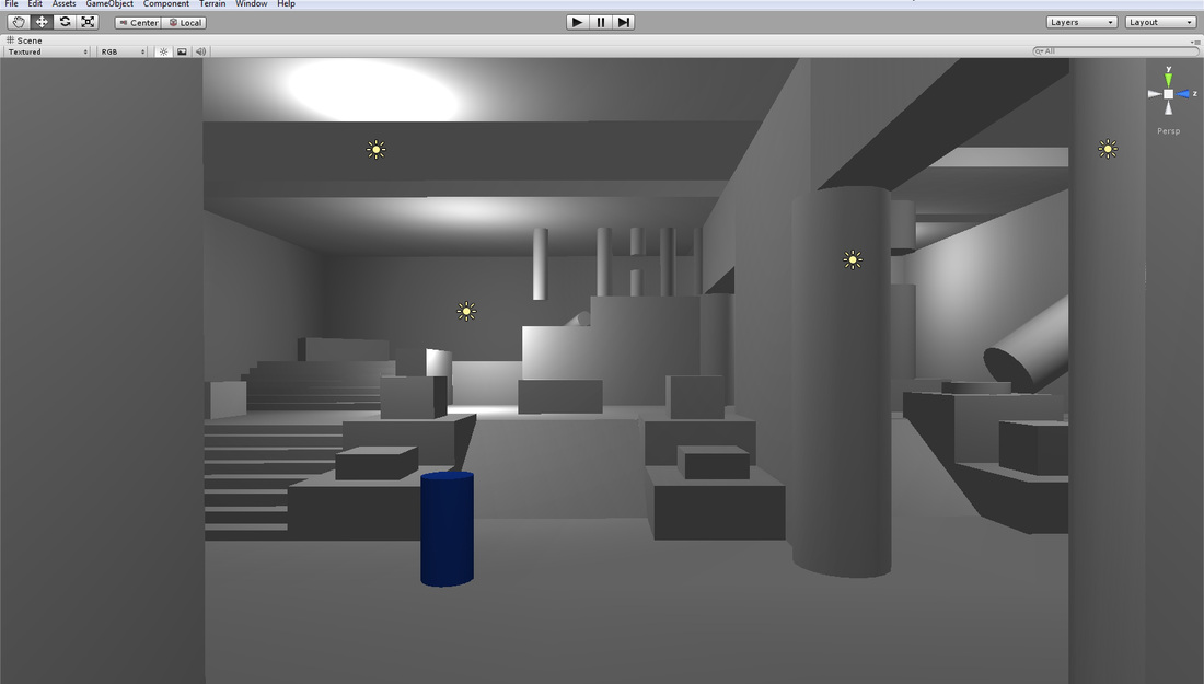
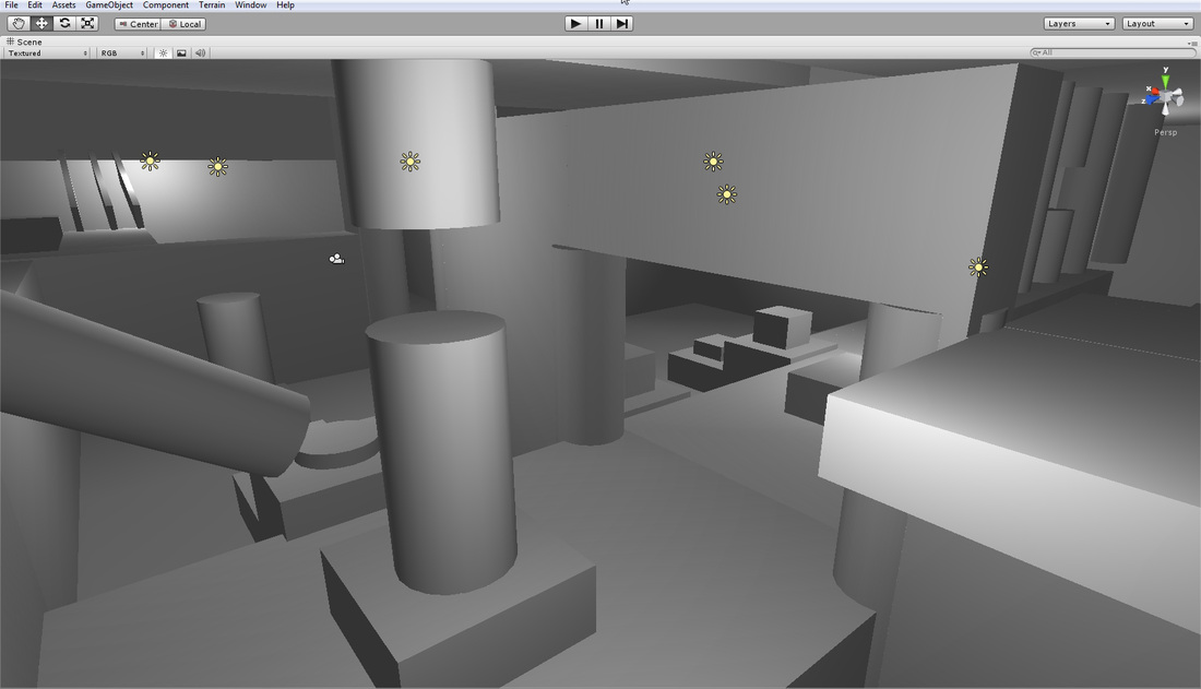
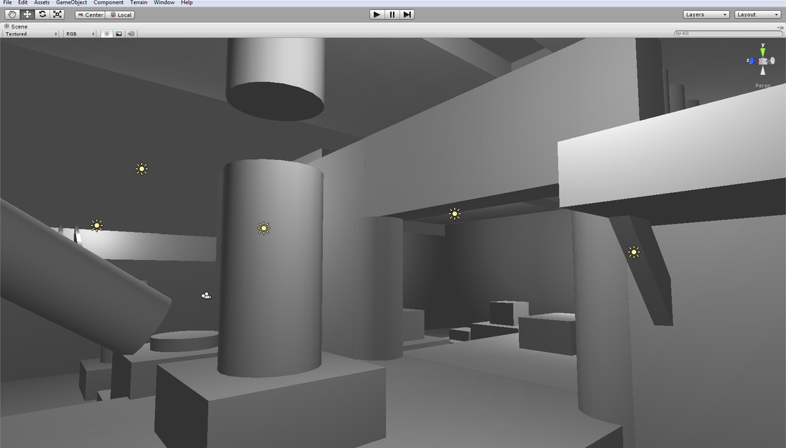
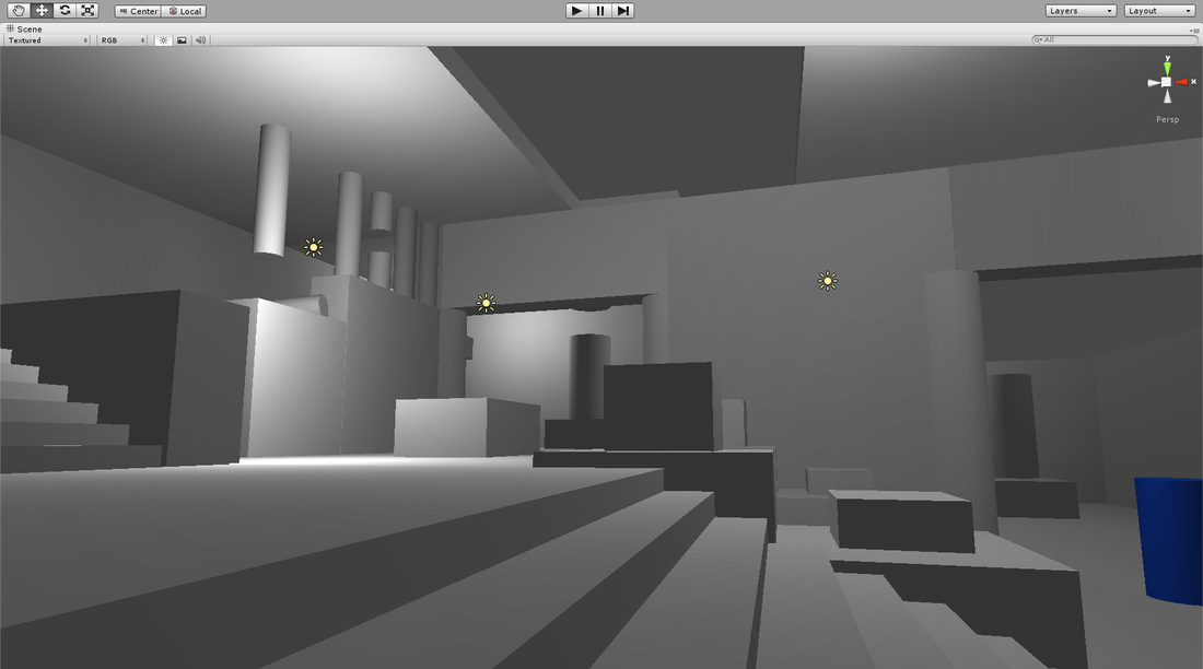
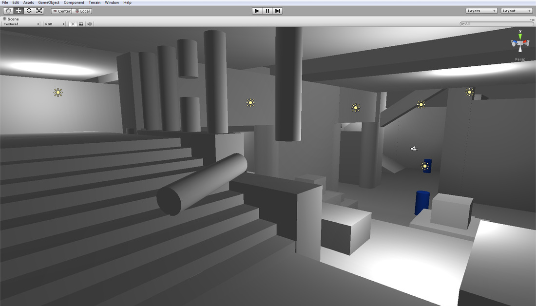
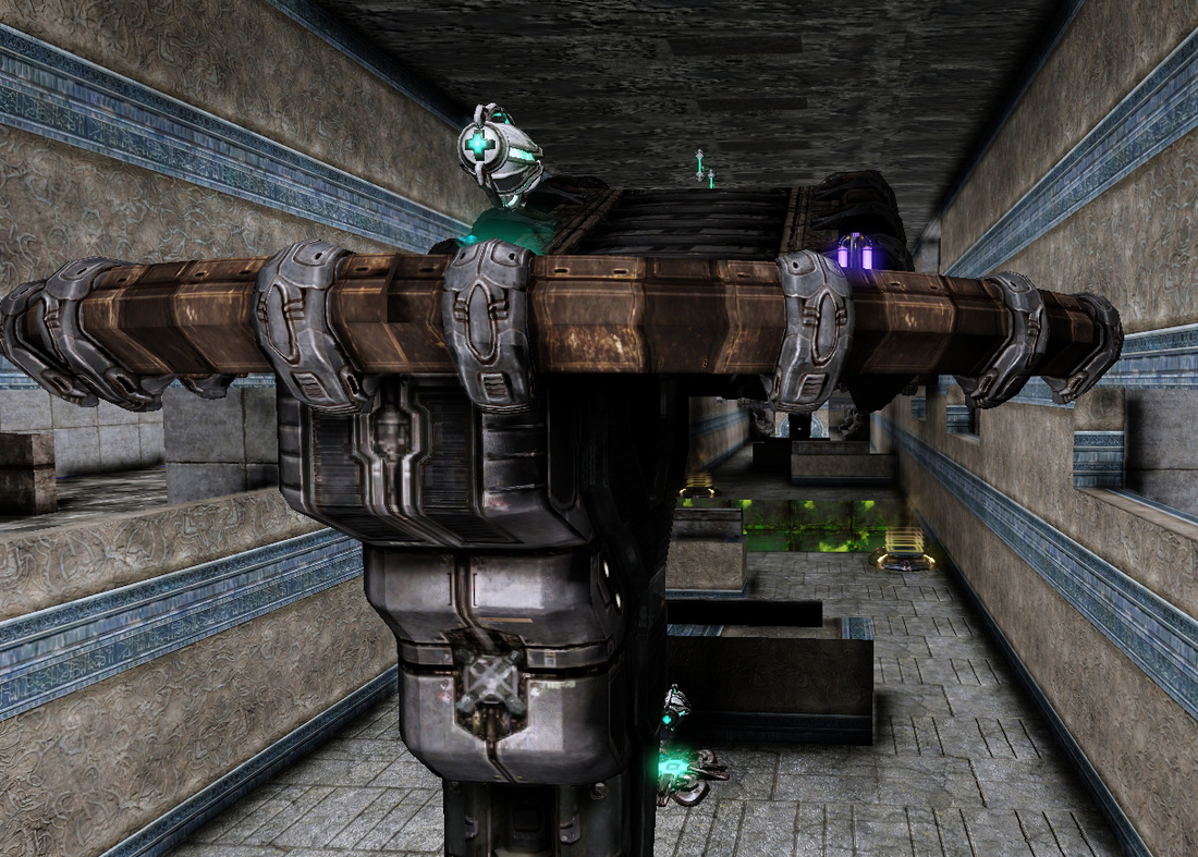
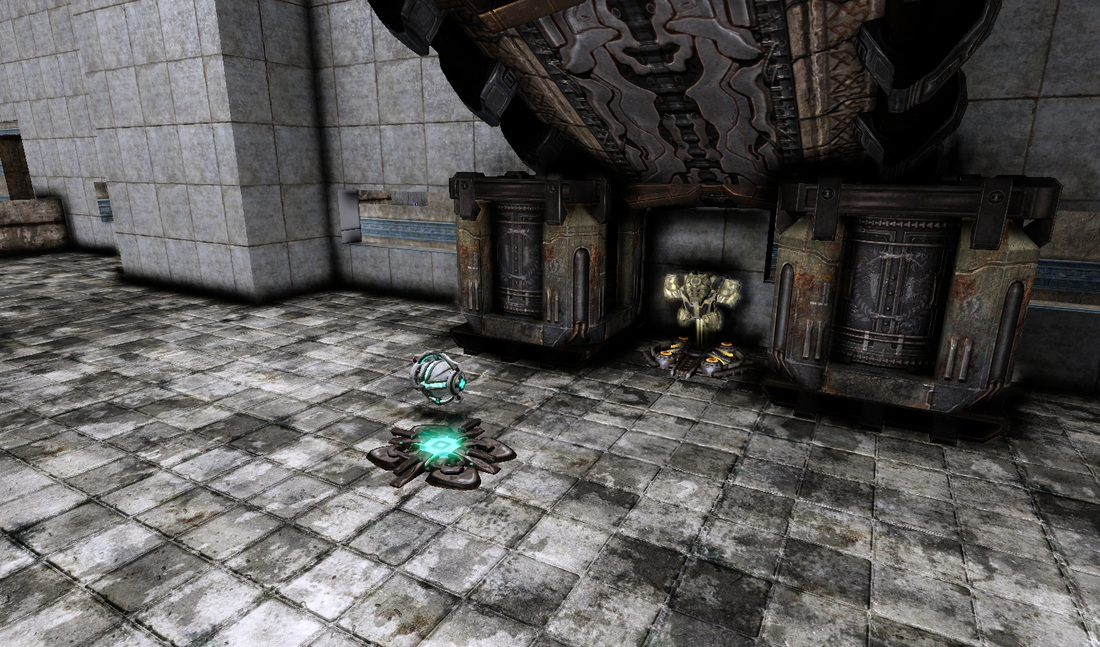
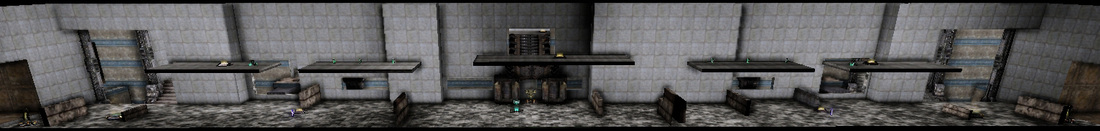
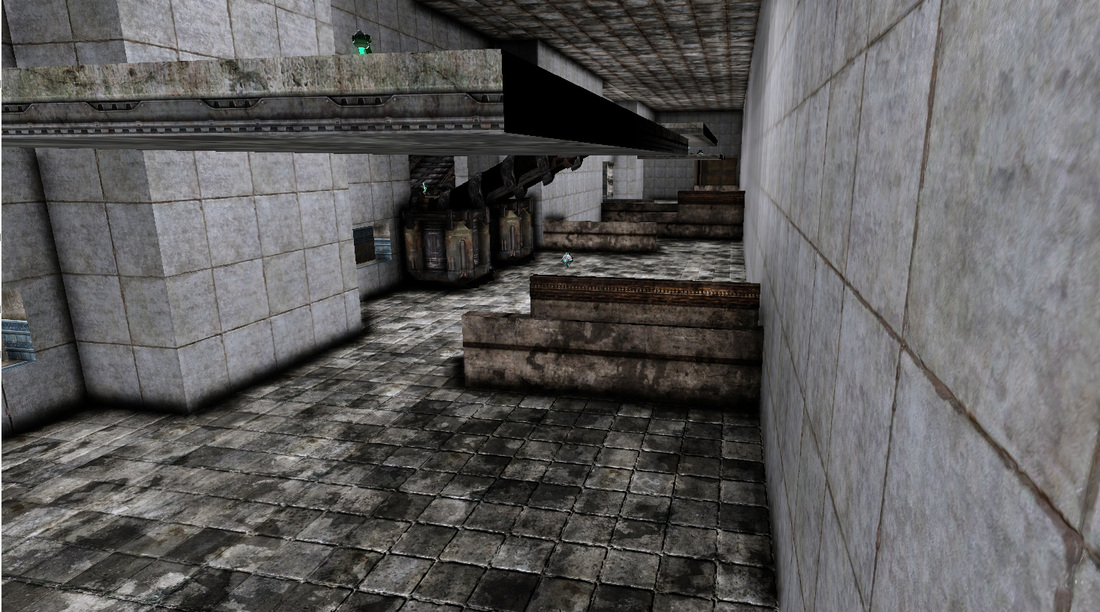
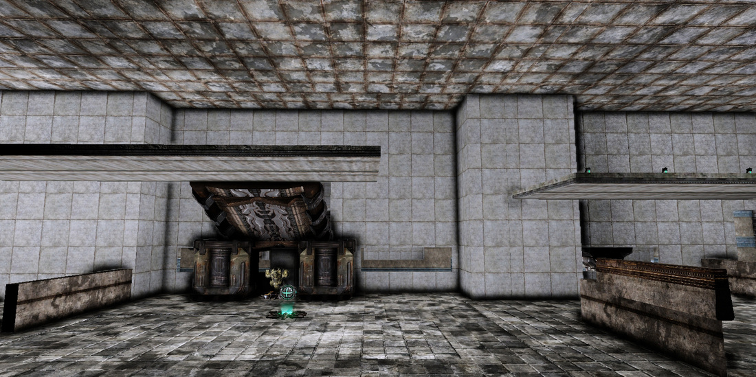
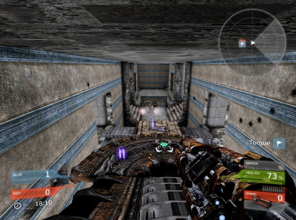
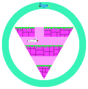
   I decided to block out a very simple looking temple all with simple game objects for practice. I dropped in a blue cylinder to represent the player.
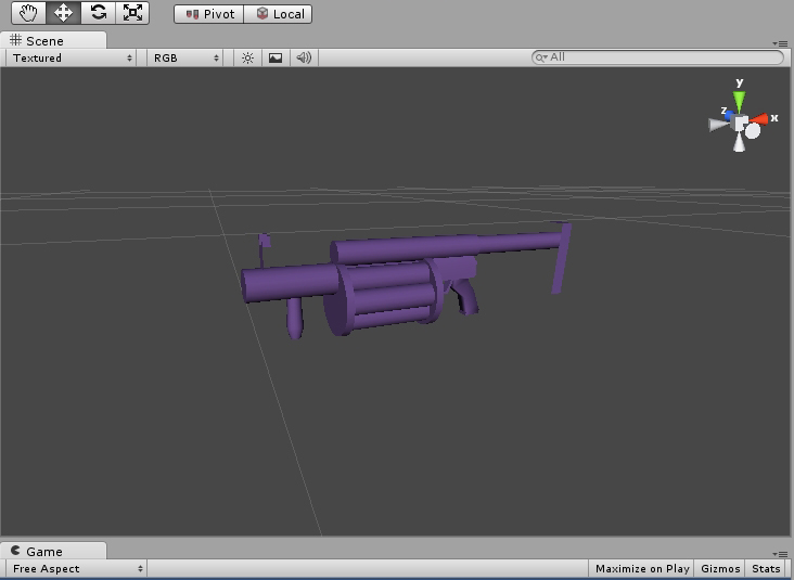
Picture
Picture
Picture
I like purple.
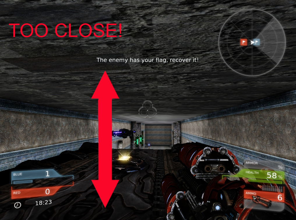
   I also imported an FBX of a placeholder grenade launcher I modeled in 3Ds Max.

- Danny Q
@Dannylv100
1 Comment

Level Design 101 : Corridors - Capture the Flag Map

12/19/2012

0 Comments


Intro

   Welcome to another edition of Level Design 101. This time we are going to be taking a look at a capture the flag map I made a few years back called Corridors. This map was made in the span of roughly a week for my first level design class. At the time this was my first attempt at a CTF map and I originally designed this map inside of the UT3 editor but midway through I shifted it over into UDK, which ruined all the weapon spawns.

Corridors

   Corridors is a map that features three direct and indirect routes into the opposing teams Base. The left and right side corridors are divided up between a bottom and top section. The top section is an array of platforms that lead directly toward the enemy base but features no cover. The bottoms section has places to take cover and fire at the opposing team safely. The map is divided in the center by a pit of death with a pool of lava at the bottom.The main hall features a bridge that connects to either corridor and leads players safely over the pit of death.
   Corridors was made with the very basic CTF rule of having at least three different routes to reach the opposing teams flag. It features a left and right corridor that leads straight to the opposing teams spawn and base. These corridors also feature a jump pad that will lead players to floating platforms that provide a quicker route at the cost of cover.

   The main hall way is the fastest way to reach the enemy flag but it is separated by the pit of death. The player is mostly covered here by some walls and has an easy to access jump pad that will propel them over to the other side. The main hall also house the main bridge that connects both of the floating platforms in the left and right corridors. 

   The flag can be found in the main hall sitting on a raised platform. The platform can be accessed by a jump pad or by crossing a small bridge from either corridor. 
FUN FACT: The pit of death is a 1,000ft drop. Originally the height of the fall was meant to kill the player, the only problem was that far too often players would wall in with too much health and inadvertently survive the fall. This lead to a kill volume being added to ensure whoever falls in dies.
Picture
One of the corridors.
Picture
The main hallway.
Picture
The main bridge connecting both bases.
Picture
The pit of death.
Picture
Some cover in the corridors.
   When this map was being built inside of UT3 the theme was going to be something that fit into the world of UT. Once it was moved into UDK most of the original textures and assets that I was using were no longer available. The theme then became Corridors, whatever that means.
Picture
Topdown inside of UDK
Picture
Red and blue represent each teams spawn.

Criteria

The level criteria is as follows:
- Spacing and Flow
- Cover Layout
- Lines of Sight
- Theme
Picture

Forced to go with the flow

Picture
The flow of the map is very direct.
   The flow of this map is very straightforward and direct. As soon as you spawn you are basically heading straight out of your spawn toward the enemy base. The problem with the way the spawn are set up is that they only serve as an area for the player to spawn. The players base serves any other purpose. Players spawn and head straight into the battlefield. The spawn should also function as a relative safe zone that allows for players to regroup and gather their thoughts. 

   The problem with this straightforward design is that the player can not change direction. Once they choose a corridor to traverse they must remain committed to reaching the end. There isn't enough flow in these hallways to allow the player to double back or to even change direction. Once they begin heading toward the enemy base they must stay on course. If they were to turn around they will surely be shot by enemy players.
PictureThe ceiling isn't properly spaced.
   The floating platforms in the level were meant to grant the players more options and freedom. The problem with these platforms is that they are poorly implemented into the design of the level. The platforms are only accessible though the use of a jump pads and therefore and usually out of the reach of the player when they might want to use them.

   The main corridor features a bridge that leads to the opposing flag, the huge issue here is that the ceiling is too close to the player. It really restricts what the player can do, they can't jump or dodge and with the resulting splash damage of explosives this bridge can easily become a hindrance to anyone trying to make use of it.

Picture
   You want your level to have flow. You want it to have many different currents that guide your player around the map naturally. The way the corridors in the map are designed like a river, it only has one strong flow to each end. The problem with this design is that it also has nothing that indicates what team/base each area belongs to. When the player spawns they have no idea where they are or what team they are on. We can fix this by adding some lights, symbols or even making the color of their spawn that of their respective team color ( i.e. red or blue). As the map sits right now everything is gray and it doesn't help the player understand where they need to go. It is very easy to get turned around in a map like this.

Lack of Soft Cover

Picture
   At first you might look at this map and think that there is a lot of cover to be found. You would be right, but the cover here is placed so haphazardly it is apparent that there wasn't much time put into it.

   Most of the cover is found in the main left and right corridor. The areas that are lacking cover are the quick pathways that float above the three paths. Originally this was intentional. The idea behind this was that the player would take a risk with the barren path so that they can have a direct route toward the enemy base or to their own base when they are carrying the flag.

Picture
   The way the cover is set up in the corridors is poor at best. Most of the cover has no real flow which leads to the player awkwardly transitioning from piece to piece. This happens because each and every cover piece is just stuck to the wall. There is no piece of cover in this area that allows for circular motion.

   Each piece of cover here is solid, there is no blending of soft cover and when we have certain pieces that look like they might be low enough to jump over it turns out that almost every cover piece can't even be jumped over. The ones that can require two jumps in quick session to pull off.

Haphazard lines of sight

Picture
The main hall has a very cramped feeling to it and the lines of sight suffer from it.
   Lines of sight are very important in a competitive first person shooter. The way this level has it's lines are sight set up are all wrong. The main hall has very cramped lines of sight while the left and right corridors have very cluttered lines of sight.
PictureThe cover clutters the players line of sight.
   The left and right corridors are very cluttered. If the player were to stand and look straight ahead they would have no clear indication on where the enemy base was located or where they enemies were coming from.

   If you take a look at the image to the left all you will notice how those cover pieces obstruct the players line of sight. From this point in the level the player can't properly asses their situation and therefore they are wasting time trying to figure out where they are and what they need to do instead of actually enjoying the map.

Picture
The player can fire into the opposing spawn from the bridge in the main hall.
   To give an example of an area that had a very clear line of sight was the bridge in the main hall. From the top of the bridge the player can see the opposing teams flag and even fire missiles into the enemy spawn. This area is poorly designed and gives whoever is on the main bridge a distinct advantage over the enemy team. This area would greatly benefit from some soft cover that would obstruct the players view of the enemy teams spawn. It is clear that this part of the map wasn't given enough thought when implemented.

Theme?

Picture
  So I mentioned earlier that the theme was "corridors", whatever that meant. So as you can probably tell, the theme is just plain awful. There is no consistency in the level, it lacks any sense of style. Just look at the walls that are supposed to appear ornate with a repeating texture that is all over the place. The ceiling looks like the kind of cement you would find out behind a liquor store and the main corridors are just generic tile.
PictureThe player spawn.
   The player spawns are just some metal texture that doesn't help the player identify where they are in the level. The major problem here was that the theme wasn't established. "Corridors" is not a theme. That is like saying that "Rocks" or "Trees" is a theme.

   A theme is when or where the map takes place. For example if we were to say this map was going to take place in the corridors of a sunken cruise ship that has washed onto a desert Island, that is a theme. The theme is what ties everything in the map together in terms of what it is going to look and feel like. The theme needs to have some sort of subject involved in it. It needs to be instantly recognizable.

   So as you can tell this is not a pretty map. It looks awful, it looks like there was no thought into how it was going to look at all. It needs a real theme to tie it all together. We know that this level has a "Pit of Death" and that can serve as something that we ca build on to incorporate into our theme.

How can we improve this level?

- Define what the theme is!
- Make the flow more fluid and circular
- Make the routes not as direct
- Give players options to retreat and fall back to
- Limit the number of double jumps
- Improve the lines of sight
- Add soft cover
- Improve the spacing of the map
- Make the player spawn more clear with use of colors and lights.
- Add color,symbols or landmarks to help the player identify where they are in the map.
- Better spacing in all the corridors


Picture
Capturing the flag!

Conclusion

Picture
   I made this map a few years ago and it was my first CTF map. At the time I couldn't see all the mistakes I was making. It was at this time that I was really playing it safe and I tried to design the map as close to the rule book as possible. I learned later that all rules toward level design are not that strict. The rules to level design can be bent if it allows for a more fun and engaging experience.
- Danny Q
@Dannylv100
0 Comments

    Dannylv100

       I am an Indie Game and Level designer, Consultant and host of Divercast.

    Space Image
    Picture

    Picture
    Picture
    Picture
    Picture
    Picture
    Picture
    Picture
    Picture

    Picture


    Submit a Question
    Picture
    Picture
    Picture

    Picture
    Dannylv100 on Twitch

    How to support Dannylv100

    Popular Podcast Episodes:

    Episode 21
    Episode 24
    Episode 25

    DLC Episodes

    Ep1 - Misc Movie Talk
    ​Ep2 - Gears 4 Impression
    ​Ep3 - A-plaque-alypse​

    Popular Indie Arcade:

    Indivisible
    ​The Night That Speaks
    ​Greedy Guns
    ​

    Popular Posts:
    Frosty's - Now on Itch.io
    How to make checkpoints....
    The Wanderer: A New Infe...

    Monthly Blog Archive

    WWP Appearance
    E3 Survival Guide
    ​Gears 4 - COG Hammerburst ​
    Knights vs Ninjas (Part 1)
    Halo 5: Warzone Accessibility 
    Halo 5: REQ Card Redesign
    ​
    New The Last of Us Enemy
    GDC 2014 Video Roundup
    ​Mass Effect 3: Tracker Class
    Mass Effect 3: DLC classes 
    ​Frosty's: Lost Levels
    ​
    Frosty's: Soundtrack
    ​Importing to UDK from Max
    ​Basic Checkpoints (UDK)
    ​
    Physics vs Scripted Events
    Picture

    Categories

    All
    Blog Post
    E3
    FF Level Design
    Flash Game
    Forge
    Forge Creation
    Freeze E Frosty
    Game Design
    Game Design Doc
    Gears Of War
    Halo 5
    In Defense Of
    Indie Arcade
    Indie Dev
    Iphone
    Iphone Game
    Itch.io
    Level Design
    Level Design 101
    Lost Chapters
    Podcast
    Steam
    Support This Site
    Thoughts
    Tutorial
    Twitch
    Udk
    Unity
    Youtube


    Archives

    September 2018
    August 2018
    July 2018
    June 2018
    May 2018
    April 2018
    February 2018
    December 2017
    October 2017
    September 2017
    August 2017
    July 2017
    June 2017
    May 2017
    April 2017
    March 2017
    February 2017
    January 2017
    December 2016
    November 2016
    October 2016
    September 2016
    August 2016
    July 2016
    June 2016
    May 2016
    April 2016
    March 2016
    February 2016
    January 2016
    December 2015
    November 2015
    October 2015
    September 2015
    August 2015
    July 2015
    June 2015
    May 2015
    April 2015
    March 2015
    February 2015
    December 2014
    November 2014
    October 2014
    September 2014
    August 2014
    July 2014
    June 2014
    May 2014
    April 2014
    March 2014
    February 2014
    January 2014
    December 2013
    September 2013
    July 2013
    June 2013
    April 2013
    February 2013
    January 2013
    December 2012
    November 2012
    October 2012
    September 2012
    August 2012
    July 2012
    June 2012
    May 2012
    April 2012
    March 2012
    February 2012
    January 2012
    November 2011
    October 2011
    September 2011
    August 2011
    June 2011
    May 2011

    RSS Feed

Powered by Create your own unique website with customizable templates.